Statistical Mapping
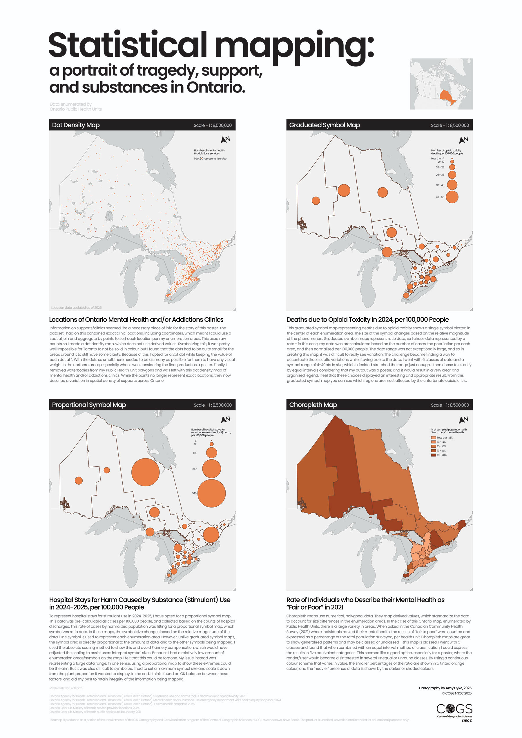
Using Public Health Units as the enumeration units for this profile on substance use in Ontario, a poster was made representing four different methods of statistical mapping: dot density, graduated symbol, proportional symbol, and choropleth. These cartographic techniques make statistical insights immediately apparent, swapping spreadsheets of numbers and coordinates for data visualization.
Key Skills
- Optimized numerical/quantitative data for statistical mapping through cleaning, filtering, and geospatial enumeration.
- Normalized and classified data for visualization, aiming to accurately depict phenomena, eliminate bias, and display honesty with social, healthcare-based content.
- Visualized information using statistical mapping methods, enhancing the portrayal of data for better viewer comprehension and support the potential for analysis.
Software
- ArcGIS Pro
- Adobe Illustrator
- Microsoft Excel