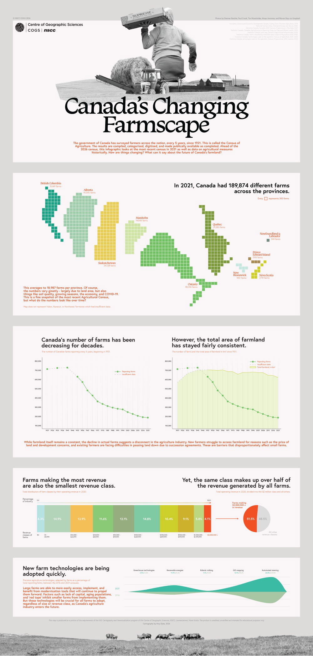
Data Viz Infographic
Info from Statistics Canada on the Canadian Agricultural Census became the foundation for this infographic, which contains data spanning over a century. I was interested in communicating the changes in data over this timeframe and learned about the ways of visualizing data that compares, contrasts, and moves across time. Completed entirely in Adobe Illustrator, I aimed to construct an accurate depiction of location-based data as well as supporting graphics, graphs, and text to portray the narrative of "Canada's Changing Farmscape".
Key Skills
- Communicated information in a visual format that analyzes and selects key topics and improves reader’s comprehension of the information, ultimately fulfilling the goals of infographic creation.
- Mapped geographic enumeration through a gridded, non-contiguous cartogram that successfully strikes a balance between graphic design aesthetics and statistical relevancy.
- Diagrammed information through a series of unique graphs, considering the purposes of graph types, levels of attribute measurement, and the ease of comprehension associated with each chart to best represent data through imagery.
Software
- Adobe Illustrator